Vivo S1 can turn out to be one kickass model for the Chinese phone maker who is still eyeing destiny more like Samsung, Huawei, or Xiaomi as far as brand trust is concerned. The first Vivo phone we used was Vivo V7 Plus, and ever since then, their subsequent models have kept impressing us. Of course, there were shortcomings and flaws in V9 and V11 Pro, but there were always more pros than cons.
Somehow, V15 and V15 Pro did not have the kind of craftsmanship we expected after the V11 Pro. Their popup selfie camera was a newer trend in favor of a full view display, but they failed to impress us aesthetically. However, it was interesting to see their motorized camera concept getting followed by Oppo F11 Pro and Huawei Y9 Prime 2019, but our views about their popups are no different.
This time, it is altogether different in the case of Vivo S1. We will talk about the design in the following part, but for now, it is enough, it’s one damn shiny gadget.
After using this phone for a couple of weeks, we realized that Vivo had created a benchmark for itself in the mid-range category. Is it rightly priced or not, and in what way it has inspired us, let’s find out below in our review.
Vivo S1 specs
- Display: 6.38 inches Super AMOLED
- OS: Android 9.0; Funtouch 9.0
- Chipset: Helio P65
- RAM/ROM: 6GB/128GB
- Camera (rear): 16MP + 8MP + 2MP
- Camera (front): 32MP
- Battery: 4500 mAh
Design and Display
The moment you hold the phone in hands, it speaks loud of its design language. We used Huawei P30 Pro a few months back, and the S1 kind of reminded us of the color pattern on its backside. Not only the skyline color resembles, but somehow, the triple-lens placement seems to have been partially inspired by their Chinese rival.
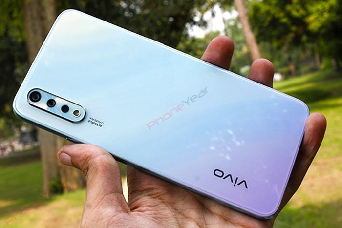
Despite its shiny rear outlook, which gives us a feel of glass, it is a plastic body that merges with the front glass through a much more polished plastic RIM. Overall, this formation has helped keep the weight of the device on the lower side.
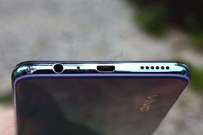
Usual controls occupy sides of the device; a dual SIM + microSD slot is on the left side that also shares the space with a dedicated Jovi button; the right side has a power key and volume rockers. The top is empty, and the bottom side is busy with our favorite audio jack, microphone hole, micro USB cable slot, and the speaker grille.
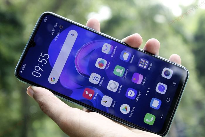
Turn on the device, and you get a full view display with a water-drop notch noticeable at the top and houses the front camera. Right above the notch, there is an ear speaker grille delicately placed at the edge.
We wouldn’t call it a bezel-less display due to a considerable bottom chin and top black stripe that appears when you try to hide the notch from the settings menu. It’s not easy though as you have to activate or deactivate the notch on the app by app basis. Vivo should have provided a universal control more like other brands.
Vivo S1 offers a Super AMOLED screen, which was the feature in Vivo V15 Pro earlier but the same was not a part of the standard V15. This time it is a common trait of both S1 and S1 Pro, which is a welcome sign. The 6.38 inches screen, 1080p resolution, further adds value to the screen beauty which does not degrade the viewing experience by more than 25% under direct sunlight. Watching from extreme angles also does not blur the view, another good sign for movie maniacs.
User Interface
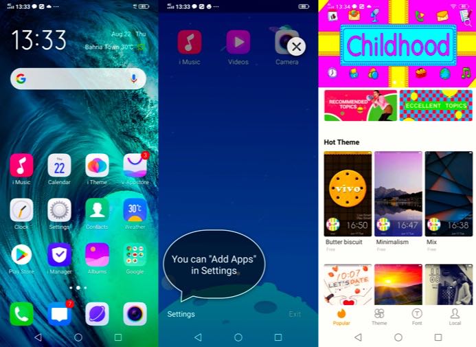
Ever since we are using Funtouch, the newer version (9.0), gives a more comprehensive feel. We don’t like the bloatware that comes attached to Chinese phones, but some of them have proven to be very useful. Honestly, I would like a few to go away; for example, vivo.com, though it gives price updates on Vivo phones, it still is an unnecessary addition.
On the other hand, Kids Mode is helpful to almost anyone who shares his/her phones with the kids. It can restrict their app’s usage and duration. Kids can’t alter the settings unless they have your password or access to the fingerprint scanner.
“i Theme” has lots of makeup and customization options, but most of them belong to the youngsters. Maybe Vivo is targeting youngsters more with this phone, but it should be bringing more stuff for all age groups.
On Vivo S1, you will likely use at least three areas more frequently; Notification Center (swipe down from the top), Control Center (swipe up from the bottom), Smart Launcher (swipe right, if enabled). You can manage most of the daily tasks from here quite easily. Instead of digging deep, you need to get used to it for easier access to almost anything.
“Easy Touch” is another easy way to access the apps and tools for quick execution, but it solely depends upon your personal choice. When turned on (Setting>>More Setting>>Easy Access), it parks a circle on the edge of the screen, tap on it, and it will show your pre-selected icons.
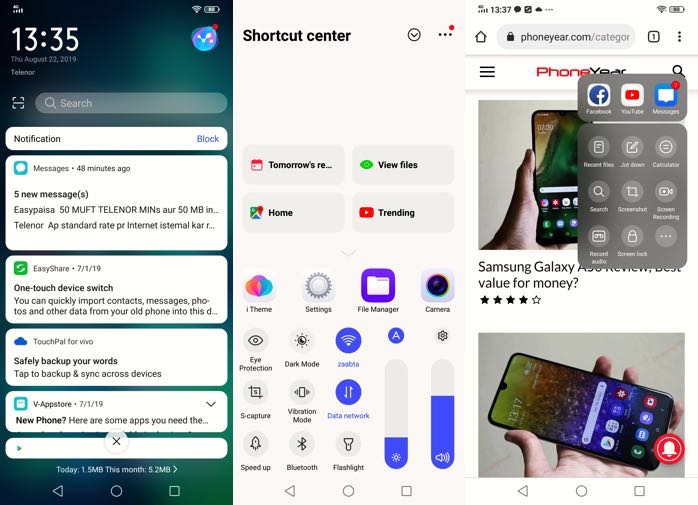
All these four areas have their benefits and limitations, but in my opinion, the pros exceed the cons. Vivo must avoid the duplicate existence of tools in these shortcut areas for improvising the user experience. The phone comes with a plethora of feature that is enough to customize the look and working of your S1, thanks to more than complex Color OS.
A Few more things I liked and disliked about this phone;
- Face unlock is quick and works like a charm, even in the dark.
- Recent apps can be blurred for keeping the privy eyes away
- Task Timer is an excellent option to avoid disturbance during critical hours
- Privacy and app encryption/file safe are handy features
- The behavior of defaults app can be changed from System App Settings
- Jovi image recognizer is still useless as before
Performance and Battery
Vivo S1 is the first phone that carries the newly launched Helio P65 (Mediatek 6768) Octa-core chipset that offers better AI support and a 2x performance boost than the previous version of the family. There is Mali G52 GPU that, coupled with the main chipset, promises better graphic handling, especially the gaming experience.
Here in Pakistan, Vivo introduced two variants, 6GB/128GB and 4GB/128GB, which work seamlessly with the new chipset.
Mediatek’s P65 scored much better on Geekbench (single-core: 1844, multiple-core 6014) than its sibling P70 did for Oppo F11 Pro and Vivo V15. Though, P65 falls in the middle of P60 and P70, but don’t let this placement confuse you as this chipset is the successor to both of them and exceeds in performance by a considerable margin.
On paper, the specs look convincing, but S1 isn’t short of skills on the ground either. It handles heavy multitasking with ease without showing a disappointing performance. We always test our phones on 4G data for keeping our tests as close to real-life usage as possible.
Heavy multitasking does not choke the phone or cause any stutter apart from a slight lag that hits us while switching the apps, especially the browser. Otherwise, the phone ran damn smooth and it never felt like a mid-range device to us.
Vivo S1 carries a 4500 mAh battery that is accompanied by the fast charging characteristic. Like many areas, the battery is another feather in S1’s cap because it lasts as long as you would expect it to. It never betrayed us, both indoors and outdoors.
It took 2 hours and 20 minutes to charge S1 on several occasions fully. However, in our back to back 720p video playtest, it lasted for 18 hours and 4 minutes. We do the video test with both the SIM cards active and the Wifi turned off.
In another session, it only dropped 12% of the battery during 113 minutes of the Netflix session while I was traveling on the highway with 4G connected all the way. The phone consumed nearly 585 MB of data while streaming movies.
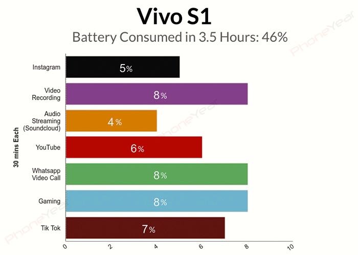
In our typical 3 hours battery test that we perform on every phone to test its might against data-hungry apps, Vivo S1 consumed 46% battery in 3.5 hours of consecutive drainage on social media, gaming, and video calling.
Here is a summary of our battery test;
Camera
Triple and quad camera is the rage today and Vivo isn’t behind. The phone comes with a triple-lens setup featuring a 16MP wide-angle, 8MP ultra-wide, and 2MP depth sensor, all placed vertically on the left side along with an LED flash underneath the lenses.
The default camera app inside is clean and straightforward, offering every required mode on the default interface which is very unlike Huawei’s camera app, where HDR, bokeh, and wide-angle ask for a couple of more clicks to reach.
In the camera department, the strength of the Vivo S1 lies in its front selfie camera. The 32MP lens of f/2.0 aperture captures some fine details of the subjects that we haven’t experienced in the earlier mid-range Vivo phones. Its autofocus tracks face brilliantly, no matter whatever you put in between the lens and the subject, the focus remains on the face.
Photos appear very pleasant on the phone’s screen, but they make you look unrealistically fairer – something very much in-demand for the social media presence. But on larger screens, images look less artificial. It’s the AI that does the magic and makes everyone beautiful.
Vivo heavily relies on the software-based beauty modes which it calls AI treatment and Vivo S1 has tons of such tools to revamp your look altogether.
The front cam offers panorama shots, videos, fun videos, and AR Stickers. Fun videos could be the most popular tool for youngsters and elders alike. Though it looks quite childish, it can be very handy for Tiktok and Instagram content creators. The tool can use a lot of inbuilt filters and background sounds for dramatizing a few seconds .mp4 social media ready video.
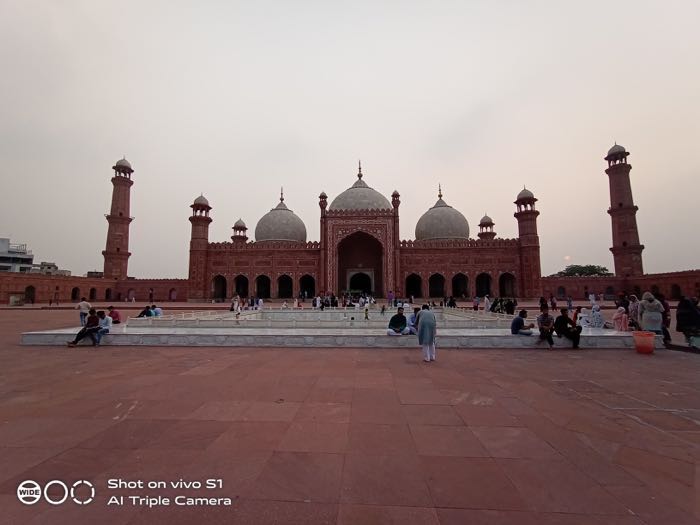
Vivo S1 can take Wide-angle and Bokeh photos through its 8MP ultrawide angle lens and 2MP depth sensor, respectively. The primary lens of 16MP can take some impressive pictures, which are mostly higher in contrast, but when the wide-angle toggle is turned on, the photos lose some essential details and a warmer effect creeps in. AI treatment in Vivo S1 is quite aggressive and a little faulty as well; it tends to overexpose the images from both, rear and front lenses.
However, the camera grabs very decent details of subjects in the standard mode. Have a look at the following two images and their cropped version to see a difference between 1x and ultra wide-angle.
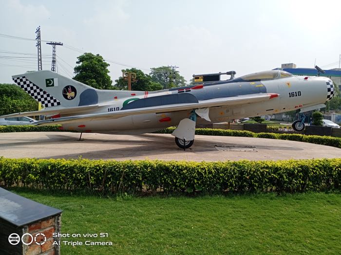
Daylight photos with both, front and rear lenses, are rich in details, HDR keeps things higher in contrast and punchy but sometimes overexposed to such an extent that makes backgrounds look flat, especially the sky. Pictures look vibrant on its AMOLED screen, and they don’t lose much of their flavor on bigger displays either.
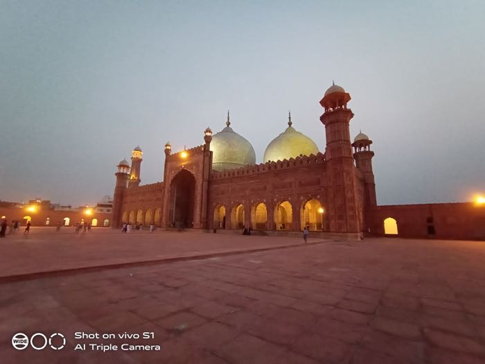
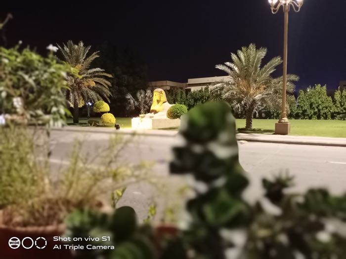
S1 doesn’t seem to struggle much at night, either, as long as you are not zooming in. It washes out some details at 1x, but going beyond 3x loses way too much.
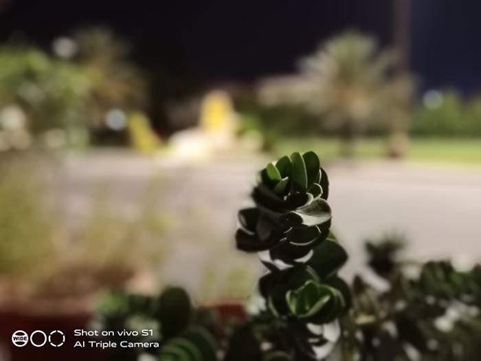
Bokeh isn’t perfect, especially for the subjects with sharp edges, and you might notice a merged outline around the subjects which sometimes spoils the photo.
Verdict
Vivo S1 is an all-rounder in the mid-range price category. This beautifully designed device can easily process everything you throw at it. Apart from the looks, the battery is the primary feature that makes Vivo S1 a much-desired device. The camera is the area where Vivo S1 still needs improvement. The bokeh is not perfect and so are the overly treated photos that look less than natural. If you are not a big fan of AI-based artificial images, turn it off, however, if you are looking for a perfect camera phone that could handle every lighting situation besides being a powerful device, Oppo F11 Pro is the phone you should consider as well.

